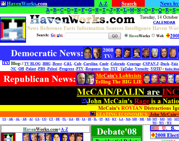
There are some things word can’t express, and this is one of them. Go on, look, I dare you. Like what you see? Evidently you can hire this guy and he’ll bring his, uh, creative skills to bear. Isn’t that like paying someone to hit you with a car? Why would you do that? Thanks to Ed Hansberry for putting this plague into my head. 😉 Want even more fun? Check out these sites.
If it were possible for eyes to vomit, surely mine would have. That is truly hideous. The blinking “s” in “MP3s” is a curious design choice. (You have to view in a browser that still renders the HTML blink tag. Thankfully Firefox lets you turn that off in the about:config page.) Another note: Do not attempt to load that site in IE Mobile; it won’t end well for your device. I had to soft reset to recover from that little mistake. Once I loaded the page on a desktop browser, I understood why. 🙂
Makes the Homer Simpson web page look pretty neat and clean
Oh, the humanity!