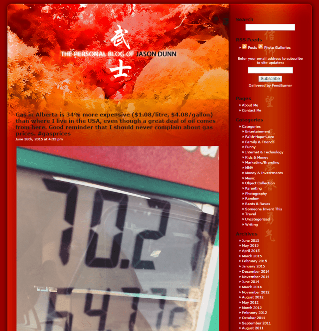
November 4th, 2006, I started this blog. And right from day one, I had a gorgeous theme for it, designed by my friend Darius Wey. Darius is one of those guys who won the talent pool lottery: he can code, design, write, photograph, and generally create something out of nothing at a level that surpasses most mere mortals (myself included). It’s not a surprise that he went on to big things in the Australian healthcare technology industry.
Back to the template…all my Thoughts Media blog templates were designed for maximum readability, and embedding of white-background graphics (since that’s what PR companies product shots 99% of the time). For my personal blog, I wanted something…different. I wanted it to reflect a completely different sense of style, something deeper to my core aesthetic, and Darius created this beautiful design that has been with me for almost a decade, aptly named Bushido. I wanted to immortalize it in a blog post so I’d never forget how gorgeous it was…

This being 2015, I needed a template that was mobile-friendly from the ground up, and something that, yes, maximized readability (because this is my only public place to publish long-form content now). I’m slowly trying to work some of the graphical elements from the previous template into my current one…
Farewell blog template of 2006!