I spent nearly my whole day on Tuesday promoting – via email, Twitter, forum posts, etc. – the longest article I’ve ever published. The topic? A 12-way photo book review. It weighs in at more than 15,000 words, has 87 images on it, and 12 videos. It’s the result of 7 months of work, and took every ounce of effort and willpower for me to complete. I’m one of those people who finds it easy to start projects, but sometimes finds it hard to finish them – and when you’ve got a project this big, with this many spinning plates, pushing through to the end can be a real challenge. One of the unfortunate themes for me in 2008/2009 was “review overload” – I took on too many things to review, said yes too many times, and as a result had far too many things on my reviewer’s to do list…and with this photo book review, I didn’t want to be the guy who requested samples from 12 different companies then doesn’t finish the review. Real artists ship, so I gritted my teeth and pushed through to completion. It was hard – really hard – but I’m glad that I made it through to the end.
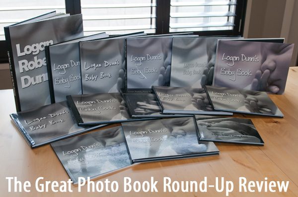
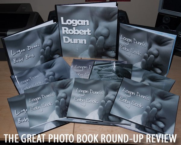
The photo above is what I ended up using for my opening image on the article, and let me tell you, it’s surprisingly hard to take pictures of a dozen objects that are different sizes, some with glossy covers, some without. In the final days before I published this review, I ended up re-shooting nearly all of the images. For instance, below was my first attempt at the opening image. I thought it was too dark, and the objects in the background were distracting (my friend Nate pointed that out to me).

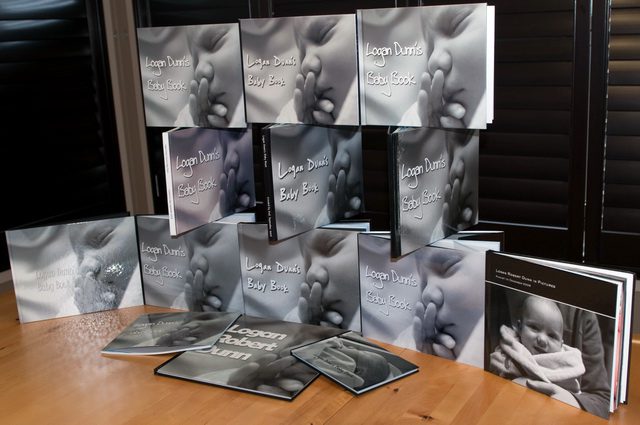
I tried to get creative with the layout of the books, but ultimately that was challenging given the different sizes and Kodak’s inability to do a full-page photo cover.

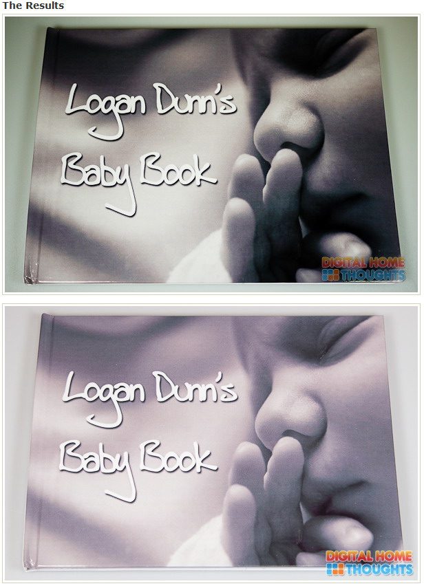
The biggest re-do I made though, and it’s one I’m really happy I did, was to re-shoot the images of the book covers (front/back) and the spine. The first time around, I shot them with my Panasonic GF-1, quick and dirty. They were dark and not great photos, and I made them even worse by processing the raw files on my HP dv2, which hasn’t been colour calibrated…the resulting images weren’t great, and some were downright awful. Below is an image that shows the original image on top for the Treasure-Book.com book, and below is my re-shoot of the cover. Quite a dramatic difference, no?

For the re-shoot, I busted out my Nikon D300 with the Nikkor 24-70mm f/2.8, put it on a tripod, extended the tripod as high as it could go, stood on a chair, and shot from above. The differences were immediately apparent, and I’m really glad I made the extra effort to re-shoot and re-edit these photos. I’d hate to have published my review, and put in all that work, only to have the photos not match up to the quality of the written portion.
And now I just have to decide if this is a review I’ll be updating over time with other photo book companies…I’m leaning toward yes given that it currently holds a unique place on the Internet as the most comprehensive photo book round-up review ever done, and if I keep adding to it, it will maintain that status (unless someone crazier than I am takes on the task).
Wow wow wow. Excellent article. Thank you very much for going over all the options. I've used Shutterfly almost exclusively for the past few years, but I'm going to give Adorama and MPix a try. What a fabulous in-depth article.
Jason
I have only skimmed the review, so far, but I've been enjoying it, very much.
….. and the baby is gorgeous!
Helen Oster
Adorama Camera Customer Service Ambassador
http://helenoster.blogspot.com
[email protected]
http://www.adorama.com
Whew!!! SUPERB!!! I really enjoyed reading this article and looking at the photo book sample with the cute photo of the baby.
YOu know what? I really love this type of photobooks. This is very nice.
Most helpful review ever! Can you tell me how you did the photo book? Looks great!
If you check out the link above to the photo book review, I have a section near the beginning that talks about using FotoFusion for this project.