You know, there’s nothing worse than working on a blog post, doing a lot of formatting on it, then losing your wireless connection a few moments before you click on the Save button – and thus losing the formatting you just did. WordPress has an auto-save feature, but it doesn’t kick in often enough for my liking. I can’t find any reference to how often it auto-saves, nor is there any option I can find that would allow me to change the frequency. Word has an auto-save function as well, but even in the 2007 version it defaults to 10 minutes. I don’t know about you, but I think most people can do a lot of typing in 10 minutes and if you lose your work after nine minutes, you’re going to wonder why it wasn’t doing it every three minutes (I usually go in and change the default in Word to three minutes). Since WordPress is software running on my server, using my resources, why can’t I set it to auto-save my post every 60 seconds if I wanted to? I’m really impressed with WordPress overall as a CMS, but I’m often baffled by certain aspects of it (such as not being able to change the thumbnail size, or making the default image insertion full size and no link).
Category: Rants & Raves
Google Copies Microsoft Live Search
So many people in the media/blogosphere have Google-coloured glasses on, sometimes it makes me groan out loud. Google just updated their image search: it now hides the image resolution, the size, the file format, and the URL the image is from until you mouse over it. When you do, a light blue box appears around the image, and the extra data is displayed. Here’s how that looks. Microsoft’s Live Search (formerly MSN Search) has always done that, and a lot more: you can use the thumbnail size slider to fit more on the screen at once and it will pull in more images for you automatically. When you mouse over an image it also zooms the image in a bit (or a lot, depending on the thumbnail size setting). Here’s how that looks. Google absolutely copied Microsoft. Do I think there’s anything wrong with that? No, not at all – I don’t think that when one company makes a change it should mean that no other company can ever do anything similar. I do think it’s important to point out a double standard when one exists though, and this is definitely one.
Microsoft Company Store Mis-Adventures
Bollocks. I really screwed this up. Today is the launch of Windows Vista and Office 2007. As a Microsoft MVP I’m given $150 “MVP bucks” which is money I can spend in the Microsoft eCompany Store. I was surprised that the online company store had stock, because there were rumours about retail gobbling up all the available copies, but they’re selling Office 2007 Home & Student (which lacks Outlook) for $30, and Office 2007 Standard
(which has Outlook) for $50. I agonized for a while trying to decide what to buy, then opted to buy five copies of Home & Student for friends and family. My family is accustomed to using Outlook, but in looking at Windows Mail and Windows Calendar on Vista, I thought that would be sufficient for their needs. I dug around in each program more, and realized that Microsoft made the incredibly stupid mistake (again) of having Windows Mail store user data (email) deep in a hidden folder, in multiple files. That will making backing up, migration, and everything else a pain. And I realized too that my father in particular is fond of Outlook, and he likely wouldn’t be happy with Mail + Calendar. So I cancelled my order for the five copies of Office 2007 Home & Student, planning on placing an order for three copies of Office 2007 Standard. And I’m still waiting. It seems that when you cancel an order, it can take up to 24 hours for your account to be credited back the MVP bucks, meaning I can’t order anything until that happens. And in 24 hours, I fully expect the company store to be completely out of stock for anything that I’d need… 🙁
UPDATE: Hooray! My “bucks” were credited back and I ordered the copes of Office 2007 that I wanted. Strangely enough though the online store didn’t have any number listed for inventory, it just said the word “inventory”. So we’ll see when these things actually show up…
Browser Width: A Response
I’ve been meaning to write a friendly response to Paul’s post since I first was alerted to it a couple of weeks ago (Paul and I know each other through Mobius), but things have been busy. Basically, Paul’s complaint is that this blog, and many others, doesn’t fill the screen. Paul explains that he has a desktop display that runs at 1680×1050 and 1600 x 1200 on his laptop (seems like those two numbers should be reversed). Paul evidently runs his browsers in full screen mode. The thing is, most people do not.
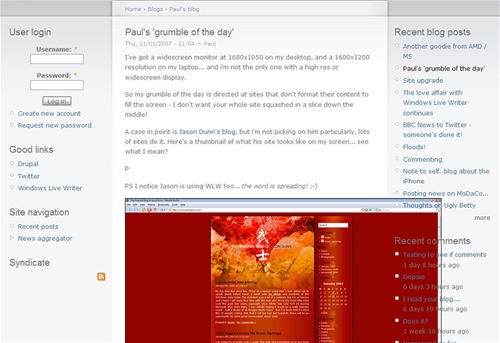
I checked the statistics for Pocket PC Thoughts (Google tracks browser window size, while unfortunately Urchin does not) and if you total up all the users who are running their browser window 1280 pixels wide and under, you get 70% of all visitors in the month of January, a strong majority. The percentage of people like Paul who are running at 1600 pixels or more wide? 12%. Not an insignificant number, but also not a huge number. When I’m on my 17″ screen laptop, which runs at 1440 x 900 resolution, I like to see multiple windows on the display at once, to help replicate the work environment that I have on my dual-monitor main workstation. Here’s what I saw when I visited Paul’s blog on said laptop:
[click on the image for the full-sized view]
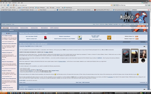
Not very pretty is it? It’s always a balancing act between the resolution of the browser window from average visitor, and the readability of the site. At the moment I have my 24″ LCD hooked up to my laptop, so I’m viewing the Web at 1920 x 1200 resolution. Take a look at what Paul’s side, MoDaCo, looks like if I were to browse in full screen like Paul does:
[click on the image for the full-sized view]
Now, just like Paul said in his post that he wasn’t picking on me, I’m not picking on MoDaCo here. But to my eyes, that’s not very readable. It’s just too wide – I have to turn my head to read it rather than just my eyes. There’s a reason why newspapers have columns – narrow(ish) columns of text are easy for the eye to follow and read. Usability matters, and while some people may prefer super-wide-pages with super-wide-text, the bulk of the Web-reading population probably does not (although I haven’t surveyed them or anything).
Now all that said, my personal blog template was designed to be around 800 pixels wide, which in retrospect is a bit too narrow given monitor resolutions in the year 2007. I’d like to have the template updated to be around 1000 to 1100 pixels wide, mostly so I can post 640 x 480-sized photos, and hope to have that done in the next month or two. It might not make Paul completely happy, but it will be a bit better for his needs while still maintaining a reasonable column width for readability
Passport Application Lines = Hell
My passport expires in February of this year, and I have to travel to Seattle in March for the MVP Summit, so it was time to get a new passport. Unfortunately, now that the USA requires Canadians to have passports for entry (effective January 23rd), it’s causing massive backlog in the system and very long times. Having no other choice but to try and “beat the traffic”, we went for it today…
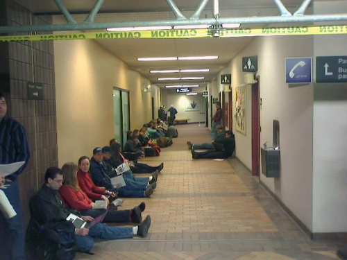
That’s a picture of the line at the Calgary Passport office. Ashley and I woke up at 5am, drove downtown, and by 6:15am we were in line – and were probably 40th or so. People kept arriving after us, and by 7:15am there had to be at least 200 people in line. The employees started arriving around 7:30am, and we watched as they walked past us, came out to get a coffee, eat a danish, then go back inside. It was all I could do not to say something to them like “Why don’t you open the doors, can’t you see all of us here?”. I brought my laptop to do some writing, but that early in the morning my neurons weren’t all firing in sync, so I opted to read Cell instead (a pretty good book). They oh-so-graciously opened the doors about 8:15am, a whole 15 minutes earlier than normal. 🙄
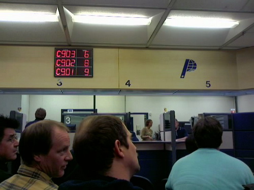
Once inside we got to sit in plastic chairs while we waited for them to call our number. We were C907, and they were already serving C903, so I was hopeful it wasn’t going to take too long. You definitely want to fill out the form online – people that had the hand-completed passport documents were processed by different booth dwellers, and there were fewer of them to help. Speaking of help, the Passport Office had 12 booths for processing people, yet only five were staffed. They have hundreds of people outside, and only five people processing. Great job government. 🙄 Thankfully, the process wasn’t too horrible once our number was called – it took perhaps 15 minutes. We were out the door by 8:45am, making the whole thing 2. 5 hours of waiting and 15 minutes of actual activity.
I find myself feeling very disappointed in how our government is handling this – they should be opening temporary passport processing offices in several places around the city. Ashley told me that Calgary has two passport offices, while all of Alberta only has three – and Price Edward Island has five in total. That makes zero sense. Processing evidently takes around a month, with the new delays, so I’m supposed to get mine near the end of February – just in time for my trip in March.
What I find interesting is that they cancel and partially destroy your current passport – meaning that I’m now unable to leave the country. What if I had a business trip that suddenly came up? What do business people do that travel a great deal? The system seems somehow broken.
Today is Hardware Day
Wow. In the span of 20 minutes, my 72″ Toshiba DLP TV was delivered, two new Dell 24″ LCD monitors arrived, and my repaired/replaced (not sure which yet) Shuttle SD11G5 was also returned. My geek head is spinning – I’m not sure which one to set up first. 🙂
Why is it so Hard to Find Good TV Reviews Online?
Here’s the backstory on why I’m looking at new TVs. This post is a rant about why it’s so hard to find reviews of big screen TVs. I suppose from a PR/marketing standpoint I know how difficult it would be to freight-ship a 72″ TV to a review site, let them keep it for a month, then arrange to get it back. Much pain. But, still, as a consumer I want to read more than just marketing fluff. If I do a specific search for “toshiba 72MX196 review”, I get only one result, a completely useless entry over at Digital Trends. If I remove the quotes, I get far more results. But are any of them quality? Let’s take a look at the “review” posted on the Yahoo page:
“i have never owned a tv that is bigger than 32 inches and i want my first one to be at least 90 inches, not only is this tv to small but it doesnt even hook up to my hairdyer. i know what i am talking about because i have a pHd in male nursing from rhode island tech new jersey state located in oregon. another con is when i am trying to cook my curi in it i cant seem to make it work, it has also become covered in wierd food substance and my friends say the picture isnt as clear anymore. that is all.”
Great, that was super helpful. Oh look, here’s another review from the Amazon.com page:
“all i can say after my research whuich was very thorough, it came down to toshiba and mitsubishi the samsung was good but not there the toshiba came ot on top vivd colours wow sharp and crisp is what you want this has it all its a must see in person buy this tv you wont be disappointed dont be fooled if you buy this toshiba make surew its the cinema series pro edition makes a big difference 72MX196”
Slightly more useful, but not terribly intelligible. Looks like AVS Forum is my only good source of information.
Belkin Cable Clips: Yeah, They Suck Too

Remember my rant about how Belkin sucks? Well, they really do, because they can’t even make cable clips worth a damn. When I re-did my office early last year, I want to make it really slick, so I purchased a whole bunch of cable clips from Belkin I put those suckers everywhere, and they worked really well…until after about six months they started to fall off the wall because Belkin used cheap adhesive. I searched and searched for better products, perhaps something metal that would screw into the wall. I couldn’t find anything, so I’ve opted instead to use Crazy Glue the Belkin clips to my wall and desk. So far they’re holding up very nicely – when in doubt Crazy Glue!
Public Service Announcement: GIFs and JPEGs Are NOT the Same

Here’s a really quick tip for all you would-be graphic designer gurus out there: there’s a reason why GIFs and JPEGs have different file-type names. They’re not the same, and one should never be used in place of the other (perhaps with rare exception. The above screen shot is from a survey Web site I went to for a restaurant called Kelsey’s. They used a GIF for photo-quality images, and the results are horrific: look at the patchy, blotchy skin on the woman’s face on the right. Does going to Kelsey’s result in eczema? No that’s just what happens when a GIF (which only has 256 colours with which to create an image) is used instead of a JPEG (which supports millions of colours). Now look at the food photo on the left – it looks somehow…wrong. Again, GIF used instead of JPEG, and the luscious colours have been pulled out of the image. Kelsey’s is a sizeable restaurant chain, so you’d think they’d be able to afford some real talent. Next PSA: remember to spay and neuter your pets!
Youtube Video Test
I’m just testing the combination of Windows Live Writer and a plugin made for it that allows you to easily plug in a video clip from YouTube, MSN Soapbox, etc. It works amazingly well – I had to install the .Net 2.0 framework, which was a faily slow process, but once I had that installed the plugin worked really well – I simply pasted the URL of the YouTube video and this tool created the embedded video quickly and easily. Nice!
