First Thoughts on the Dell XPS 13 (2015 Edition)

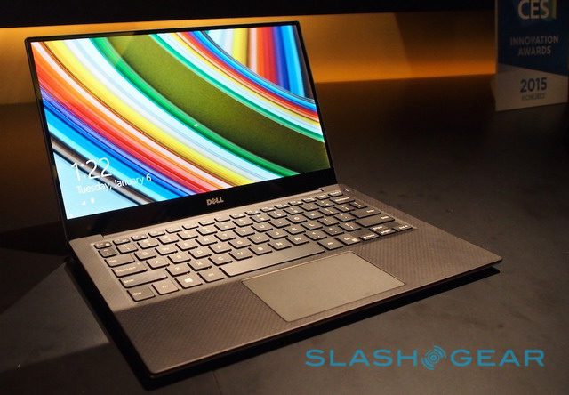
I’ve been meaning to post some thoughts on my new Dell XPS 13, but haven’t quite gotten around to it. What I did do tonight was type up a long comment that I posted over on PC World’s review of the XPS 13 (by none other than the legendary Gordon Mah Ung). Another fantastic review is by Lisa Gade of MobileTechReview (the photo below is courtesy of her review).
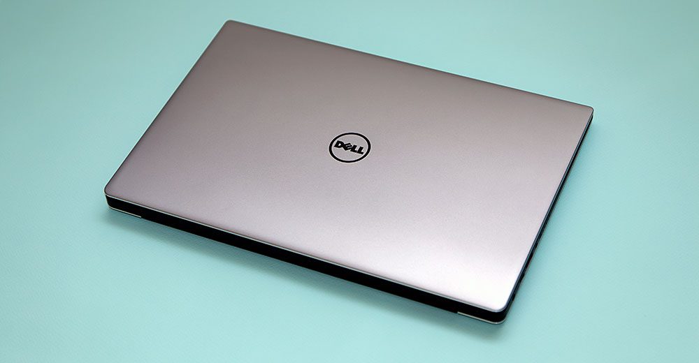
dell_xps13_2015_lead

My comment/mini-review is below:

***

I now own the Dell XPS 13 – the top-end Core i7 QHD+ model with the 512 GB SSD. It’s quite a machine – Dell did an impressive job with the build quality and the overall package is impressive. It’s expensive though to get that top-end model. The 512 GB SSD upgrade alone was $300. Ouch! I’m ticked that Dell doesn’t allow us to truly customize what we want – I wanted the 1080p display but couldn’t get the 512 GB SSD without also getting the QHD+ display. Why does Apple offer more customization now than Dell? That’s just wrong.

Four main things irk me now:

1) The fact that the M.2 SSD isn’t PCIe and Dell told you they’re planning on releasing a version of the laptop that uses PCIe. What the hell? I just got this thing a few days ago, and it’s already going to be replaced by something newer? Is Dell taking PR lessons from Osborne?

2) Windows 8.1 is still a mess in high DPI mode. Well, to be fair, the OS itself isn’t too awful with the DPI scaling set to 250%, but apps are a mess. Blurry text in TweetDeck. Weird scaling and overlap of UI elements in all sorts of other apps. A magnifying glass in Lightroom the size of a grain of sand. It’s frustrating realizing I have to wait for Windows 10 to supposedly make this all better. Microsoft really wasn’t ready for laptops with screens quite this high-res…they should have been deprecating APIs and forcing developers to code for high-res displays, or found some way to auto-fix the issue.

3) The battery life is nowhere near what Dell claims. I’m used to OEMs being dishonest about real-world battery life, but we’re talking a 50% difference here. I’d say real-world usage of my XPS 13 in productivity and Lightroom (zero gaming) is about 6-7 hours. Good, but not great. And Dell announced great.

4) With all the rumours of Intel releasing Skylake this year, it feels like when Windows 10 comes out there will be a whole new generation of laptops, giving Broadwell U laptops a shelf life of maybe 6-8 months. There’s always something better around the corner, but the delays in Broadwell and the noise that Intel is already making about Skylake makes me concerned Broadwell U will be jumped over very quickly.

All in all,  there’s a LOT to love here, but given that I only buy new laptops about every three years, I’m not sure this is the right one at the right time.

How To Speed Up Lightroom 5 JPEG Export by 32%

UPDATE: The good news is that Lightroom CC has addressed this issue. When I do a JPEG export now, it uses up nearly all CPU resources, so much so that my laptop gets a bit unresponsive (which is expected).

LightroomCC-Multi-Threaded-JPEG-output

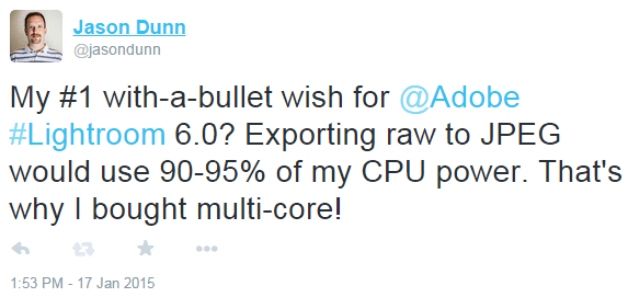
It all started with one of my customary tweet rants:

adobe-jpeg-export-slow-tweet

I was pointed to a great article written a couple of years ago that involved some great testing and tips for optimizing the JPEG output from Lightroom 2.x (thanks to @MarkusTyphoon for the tip). The main discovery is that Lightroom simply does not fully take advantage of multi-core and multi-threaded CPUs for JPEG exporting. This wasn’t news to me, but the detailed level of testing was impressive, as was the solution for a work-around: use simultaneous export processes.

lightroom-export-selections

I decided to replicate the tests on my own laptop; these files are ~25 MB Nikon D750 raw files being chewed on by an aging Core i7-2667 at 2.4 Ghz on battery power. Here’s what I discovered:

  • Exporting 38 images as a single export batch took 529 seconds
  • Exporting 38 images in three simultaneous batches (14 + 14 + 10 images) took 402 seconds
  • I saw Lightroom CPU usage shoot up from the norm of bouncing between 45% and 85% to lock in around 90% to 98% and stay that high:

lightroom-cpu-usage-three-batch-export

The net result? Exporting the images using multiple processes shaved 32% off the rendering time. That’s huge!

How to do this? Select your first image, then hold the shift key and click on an image 1/3rd of the way through your set. Press CONTROL+SHIFT+E to bring up the export window and start the first JPEG export. Repeat this process three more times with the remaining images, and you should see Lightroom processing three export jobs:

lightroom-three-batch-process-exports

32% faster exports is a significant time saving, especially if you’re exporting a set with several hundred images (which pros do regularly). I’ll likely repeat these tests when I move to a 6-core system later this year (Haswell-E? Broadwell? Skylake? Too many choices!). With more physical cores, there may be an opportunity for more time savings if there are more than three export processes going on simultaneously.

Now if only Lightroom 6 would do something useful like take advantage of GPU acceleration and not feel so damn sluggish all the time…

Google Nexus 7 Device Not Found Error: The Fix

The fix for the “Device Not Found” error? Disconnect your Nexus 7. Install the Google USB device drivers (unzip, then right-click on android_winusb.inf and select Install). Wait for the install to complete, and connect your Nexus 7. That should do that trick!

Then you can install this minimal ADB/Fastboot tool and one of the software images directly from Google. Remember to put it into bootloader mode by turning it off, then pressing and holding volume-up while pressing the power button. Then you connect the cable and run the re-flashing commands located on the Google page above. This is how I got my 2012-era Nexus 7 back to Android 4.4.4 after how terrible it performs on 5.0.2.

The back story:

When I first installed Android Jellybean 5.0 on my original Nexus 7, I was excited and impressed that Google was supporting this 2012-era hardware with the latest and greatest version of Android. That’s what buying a Nexus device is all about, right? After a few weeks though, my excitement turned to frustration as it became clear the device was incredibly sluggish. It plays a very specific role in our household: it sits in a dock 24/7 and is used for music streaming to a Logitech Bluetooth receiver that’s hooked up to a whole-home amp. Playing music isn’t a hard task. You’d think for this one thing the Nexus 7 would work, right?

Not a chance. With a fresh from-scratch flash of Android 5.02, using Google Play Music was still painful. It would lock up while playing a song and become non-responsive. It was a disaster. What possessed Google to approve the release of this software for the 2012 Nexus 7? It clearly can’t handle it properly.  I’ve read all sorts of theories why – from poor NAND flash and storage controllers to limitations of the GPU – but the bottom line from my perspective is that Google made a grave error in inflicting this software on owners of the 2012-era Nexus 7. They should have released the software to let enthusiasts fiddle with it, and the hardcore users can decide if they wanted it, but spared the rest of us.

The good news is that because Google offers up older software images, and allows easy down-grades, I’ve put Android 4.4.4 on there and it’s back to working great. HTC and other OEMs should emulate what Google is doing here.

Now I’m stuck with a device that’s constantly prompting me to upgrade – one touch will trigger the “softwarepocalypse” – and there’s no easy way to stop the notifications other than rotting the device and installing a configuration tool.

Dell XPS 13 2015 Edition: You Shall Be Mine!

OLYMPUS DIGITAL CAMERA/ photo courtesy of Slashgear /

I’m tremendously excited what Dell has done with the new XPS 13, announced at CES 2015 recently. Talk about some amazing hardware design! It’s been a few years since I owned a Dell laptop – my last one was a Dell Vostro V13, which was a decent laptop for day to day work with a nice design, but ultimately had a very ho-hum screen, was underpowered, and had fairly poor battery life.

For the past three years, I’ve been using an HP Envy 14 Spectre – an audacious, premium design from HP that sadly was a one-off and not the first of a new line. Sure, they’ve carried the ENVY name forward, but none of them have been Spectres or been premium. The Envy 14 Spectre was, and is, a fast machine with a great design. The overall weight though makes it a hassle for travel, and the battery life isn’t anything to write home about. I was particularly frustrated when, after ordering if the first week it came out, within a month of getting it Intel had announced new chips – HP decided to release this new product at the end of a chip cycle from Intel. This was right after I’d moved to the USA, and I frankly wasn’t in the loop on Intel’s roadmap. It’s still a fast laptop for most things, but I’d have preferred to wait and get the newer generation of chip from Intel, all things being equal.

The new Dell XPS 13 comes with a Broadwell-U chip. I’d initially been excited about the Core M chips and the idea of a fanless design, but once I saw how performance-limited they were, I decided I needed to go for a Broadwell-U chip. Here’s what’s funny though: Broadwell was supposed to ship in products last year, and all the rumours point to Intel releasing Skylake midway this year. Skylake is a new chip design and promises significant advances over Broadwell…so by ordering this Dell XPS 13, am I setting myself up for another scenario where mere months after I get a new product there’s already a new chipset? Could be. At least this time I know about it! Hopefully if Skylake products won’t ship until Q3/Q4, I won’t feel bad about snagging a Broadwell-U based system…as long as it rocks, that’s all I care about.

Dell used to be the king of customization, but I find it ironic and sad that now that seems to be more Apple’s game: I can order a Macbook Air with a Core i5 or i7 CPU, 4 GB or 8 GB of RAM, and a choice of 256 GB or 512 GB SSD. Dell has a few configs, but if you want a 512 GB SSD, there’s only ONE config: the Core i7, 8 GB of RAM, and the QHD+ touchscreen display. I’d have been perfectly happy with the 1920 x 1080p non-touch display as that unit gets better battery life…somehow Dell decided not to let people pick that option. I’m feeling very iffy about Window 8.1’s ability to handle a resolution that high. I’ve never liked how the Windows UI looks with high-dpi settings turned on, so I’m a bit concerned how well this display is going to work with my apps (and eyes).

After wasting two days playing telephone tag with Dell – their practice of needing to call you on the phone to verify your order is as old-fashioned and quaint as it is wasteful and inefficient – my laptop is finally in pre-production. I expect to have it in my hands by February 6th…can’t wait!

Unlisted YouTube Videos Do Work Properly on Twitter

Earlier today I needed an answer to a simple question: if you posted a YouTube link to an unlisted video on Twitter, would it embed the video properly in the feed and work exactly like a public video? Surprisingly, I couldn’t find the answer despite several searches. So I performed a quick experiment, first uploading a video of my son to my personal YouTube account and marking it as unlisted:

youtube-unlisted2

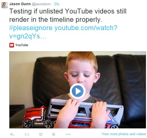
Then I took the YouTube link and posted it to Twitter. The video embedded in the timeline just as you’d expect:

youtube-unlisted

So there you go: post your unlisted videos on Twitter and they’ll work just like you want them to.

Blockless Ad Blocker: The FAQ They Missed

Yes, I’m kind of a smart-ass sometimes, but this is really how I feel about ad-blockers. Despite how much I like Blockless (DNS trickery is so much cleaner than a full-blown VPN solution), I won’t be paying for their service. As someone who once made a living off providing content for free, and supported his family off of advertising, I know that ad blocking is theft. It’s just a theft that most people can’t wrap their brains around because there’s no real-world equivalent.

Blockless-Ad-Blocking

UPDATE: To their credit, the community manager at Blockless replied to my email: “As a professional who has sold advertising for over 5 years, currently uses advertising and manages many affiliates of Blockless I have to disagree. Either way you are entitled to your opinion and not sure if you noticed but Ad Blocker does have an off button. Let me know the email attached to your account and I will cancel and unsubscribe you from our service.” If he was on the publisher side, he’d get it.

WordPress JetPack Annual Report Shames Me

As if I didn’t already realize how little I wrote here in 2014, the very cool WordPress JetPack plugin/service sent out an email showing me exactly how little…2015 is going to have a lot more green boxes!

blogging-in-2014

Is Twitter a River or a Glass of Water? Depends On Who You Ask

Twitter, like all social networks, doesn’t come with a rulebook. Sure, there are technical limitations to what you can and can’t do with it, but just like all flexible communication technologies that came before it – faxing, email, texting, IM, etc. – the way it’s used is defined by the people who are using it. Different peer groups will have different implementations; the way two 30-something’s text is radically different from the way two tweener’s text.

Twitter is no different. Over the couple of years I’ve been using Twitter, I’ve been surprised – and sometimes amused – at the friction caused by mis-aligned expectations of how Twitter “should” be used. I’ve been asked a couple of times to explain how I use Twitter, so here’s that long-overdue blog post.

I think in general there are two camps on Twitter: those that treat it like a river and those that treat it like a glass of water.

Twitter as a River: Your Twitter stream is a rushing flow of information. You follow many hundreds or thousands of people, and what you see from them is what is in your feed when you open up your Twitter client. You see what’s flowing when you step into the river, and when you step out, everything keeps flowing. When you come back to it, what came before doesn’t matter because there’d be too much to try and read. You can follow as many people as you want because unless they have an ultra-high output on Twitter, you may never see what they tweet. Oh, and if you’re following thousands of people and claiming you’re reading everything they tweet, you’re either lying or unemployed (or maybe both).

Twitter as a Glass of Water: Your Twitter stream is a large glass of water. It’s something you can drink in one sitting, or maybe you sip it regularly throughout the day. You follow a few dozen people (or maybe a hundred low-volume streams), but you read everything they post. When you load up your Twitter client, you scroll back to read what you missed. You take it all in.

I treat Twitter as a glass of water; right now I follow around 100 people/companies, but more than half don’t even post daily. The exceptions are sometimes Engadget and Business Insider; their output is so heavy I often skip past Tweets (especially Business Insider – I’ve unfollowed several times because they tend to get pretty spammy).

When I start to follow someone, I’m going to read everything they post. If, after a few days/weeks their Twitter subject matter isn’t interesting to me and/or their volume of tweets is overwhelming, I un-follow. I could say it’s nothing personal, but it kind of is – your Twitter stream is a partial reflection of who you are as a person, and what interests you. I think Twitter works best when people find the topics that interest them the most rather than the people (unless the person they’re following is consistently tweeting about one topic).

When I un-follow someone on Twitter, and they notice and ask me why (which is a bit awkward in itself, but I don’t shirk from answering), my response is typically along these lines – that they either tweet too much for me (too much noise and not enough signal), or what they’re tweeting about is on a topic that doesn’t interest me. I’m not offended if someone stops following me on Twitter, but I tend to find most people don’t share that reaction – I’ve had more than a few people get offended and hurt when I stop following them. I don’t know if there’s a way around that without being dishonest.

I don’t pretend that everything I tweet is going to be of interest to the whole world, but I do try to post thoughtful comments or questions that add value in some way through insight, humour, or something I’ve discovered worth sharing. I do not tweet “Good morning”, I do not tweet “Good night”, I do not tweet that I’m hungry, or that I’m sleepy. I ask myself with every tweet if what I’m posting is worth a few seconds of someone’s time or not. How I wish more people did that! If, however, you’re using Twitter as a personal diary and posting only for your own benefit, that’s fine – but don’t get offended when someone doesn’t want to follow you.

Ultimately the strength of Twitter is that I can follow you without you following me; it’s an asynchronous system that works well, even when we all have different ways of using it.

River image courtesy of this site; glass of water courtesy of this one.

Another Piece of My Web History Archived: The Two Inch View

As I transition from my old life to my new life – that sounds so dramatic, doesn’t it? – I’m letting certain domains lapse and taking projects from an “archived on their own domain” state to a “archived on this site” state. I think the Internet is one of the greatest made-made creations there is, and I hate to see any of the information shared on it – no matter how trivial – be obliterated.

I’m especially thankful to the creators of HTTrack Website Copier for making a tool that allows people like me to take our work and archive a whole domain’s worth to a single folder. Comments get lost in the case of a WordPress blog, which is a shame, but it’s a small price to pay for the ability to archive an entire site.

I won’t pretend that archiving the site below is anything other than an ego trip of wanting to remember the work I did in years past, but as someone who has a passion for keeping digital memories of all sorts, this is something I’d been planning for a while.

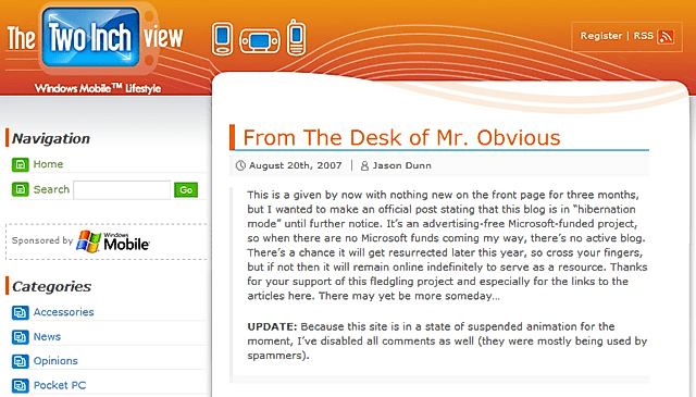
The Two Inch View was a Web site I created under contract for Microsoft. This was back in the heady days of Pocket PCs, Smartphones (note the capital “S” on that), and Portable Media Centers (a.k.a PMCs). A contact of mine at Microsoft wanted an “instant content portal”, so I created one. It was all real content, written by me, but it was created to support specific marketing pushes – each month I’d suggest topics for them, and we’d decide what would get written about. It was a fun little sandbox to play in, different from Pocket PC Thoughts and my other sites.

The amazing WordPress theme was designed by my friend, Fabrizio Fiandanese, and I recall getting several messages a month asking where I got the WordPress theme from, whether or not it was for sale, etc. It was a beautiful Web site for its time (and still is).

In my current role for HTC and dealing with vendors, I kind of chuckle at some of the ways I thought back when I did this project…if only I knew then what I know now! Enough talk, into the archives it goes

Start With the Customer Experience and Work Backwards

Truer words have never been spoken: you don’t start with a cool technology and try to market it to customers…you start with the need of a customer, find the cool technology to address that need, then market the solution. It will sell itself. I’ve lost count of the number of products I’ve seen/reviewed where the technology is all the product has going for it; the customer experience is a disaster. I wish more companies understood this…