I’ve been meaning to write a friendly response to Paul’s post since I first was alerted to it a couple of weeks ago (Paul and I know each other through Mobius), but things have been busy. Basically, Paul’s complaint is that this blog, and many others, doesn’t fill the screen. Paul explains that he has a desktop display that runs at 1680×1050 and 1600 x 1200 on his laptop (seems like those two numbers should be reversed). Paul evidently runs his browsers in full screen mode. The thing is, most people do not.
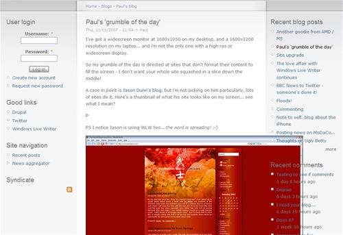
I checked the statistics for Pocket PC Thoughts (Google tracks browser window size, while unfortunately Urchin does not) and if you total up all the users who are running their browser window 1280 pixels wide and under, you get 70% of all visitors in the month of January, a strong majority. The percentage of people like Paul who are running at 1600 pixels or more wide? 12%. Not an insignificant number, but also not a huge number. When I’m on my 17″ screen laptop, which runs at 1440 x 900 resolution, I like to see multiple windows on the display at once, to help replicate the work environment that I have on my dual-monitor main workstation. Here’s what I saw when I visited Paul’s blog on said laptop:
[click on the image for the full-sized view]
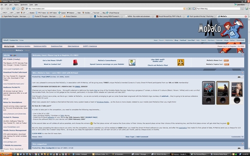
Not very pretty is it? It’s always a balancing act between the resolution of the browser window from average visitor, and the readability of the site. At the moment I have my 24″ LCD hooked up to my laptop, so I’m viewing the Web at 1920 x 1200 resolution. Take a look at what Paul’s side, MoDaCo, looks like if I were to browse in full screen like Paul does:
[click on the image for the full-sized view]
Now, just like Paul said in his post that he wasn’t picking on me, I’m not picking on MoDaCo here. But to my eyes, that’s not very readable. It’s just too wide – I have to turn my head to read it rather than just my eyes. There’s a reason why newspapers have columns – narrow(ish) columns of text are easy for the eye to follow and read. Usability matters, and while some people may prefer super-wide-pages with super-wide-text, the bulk of the Web-reading population probably does not (although I haven’t surveyed them or anything).
Now all that said, my personal blog template was designed to be around 800 pixels wide, which in retrospect is a bit too narrow given monitor resolutions in the year 2007. I’d like to have the template updated to be around 1000 to 1100 pixels wide, mostly so I can post 640 x 480-sized photos, and hope to have that done in the next month or two. It might not make Paul completely happy, but it will be a bit better for his needs while still maintaining a reasonable column width for readability


Jason, I couldn’t agree with you more. Good design should never be at the expense of readability, and you’re spot-on about needing to move both your eyes and your head when viewing an ultra-wide Web page at a super-sized resolution. It’s downright uncomfortable.
With the advent of RSS and good readers like Bloglines, I read most of my content in locations other than the original Web site. Thankfully, Bloglines and many other quality readers work well whether I’m on my widescreen laptop at home, my small desktop PC at work or my Windows Mobile phone. I’m always pleasantly surprised, however, when I click through a feed to comment and find a site as good looking as JasonDunn.com and the Thoughts Media network. Cheers!
Thanks for the comment.
“I read most of my content in locations other than the original Web site.”
As a personal blogger without ads, that comment makes me smile.
As a professional with a news site that has ads, that comment makes me weep. 😉
It’s quite interesting to see your stats showing that much high resolution readership but I guess it’s really tied to your audience. You run technology enthusiast sites so it’s not suprising to see 12% above 1600. I am privy to the stats of a several top etailer sites and I can assure you that the general public by and large is still hugely in favor of 800×600 and 1024×768 and just barely edging into larger displays.
I also agree that too wide is too hard to read. The eye doesn’t track back to the next line easily when you’re having to scan back over the width of a 24″ widescreen. I use dual 20″ widescreens here and I rarely run anything maximized to that resolution.
Yeah, the 1024 limit is where I think a fair “middle ground” resolution is for Web sites. Our template for Zune Thoughts is 1000 pixels wide (give or take) and I always chuckle when I come across Web sites that are designed for 1200+ pixels in width.
Heh, I think my blog/site must also look ugly on higher resolutions, although I fine-tuned it to my 15 inch screen on a 1680 x 1050 resolution. I’ve tried making the site a bit more readable, and I guess the measure of readability is YMMV. 😉
The Modaco site doesn’t look that nice in the screenshot you took, and fixed widths might be better/worse depending on which browser you use. In this case, some extra column of ads, or relevant content, would fit just fine. The main problem is probably that it can be tricky (?) to implement.
There are certain sites that offer the possibility of chaning the CSS by clicking a button, and that should be the place to leave an option for anyone running ultra-high resolutions. The option I tend to use with width flowing sites is zooming in using the browser and turn on “fit to width”. (The bonus is that reading is a lot more easier on the eyes) Here’s a screenshot of how I like to zoom in. 🙂
And if Paul is reading this, umm… trying to read this with no filled screen effect, then he should really try another web browser! 😀
I should point out that I’m well aware of the irony of a post about readability from a guy who has a blog with white text on a red background that isn’t super easy to read. 😆
“As a professional with a news site that has ads, that comment makes me weep. ;-)”
Don’t we embed ads in the full-content feeds? 🙂
“Don’t we embed ads in the full-content feeds?”
We do, but there aren’t enough RSS ads coming from Feedburner to put one in every feed, so not every piece of content is monetized. Also, a single RSS ad can’t equal the ads on the rest of the site.
First things first… my blog (PaulOBrien.net) was whipped up quick smart using the standard Drupal skin, so I make no apologies for how it currently looks. I should verify posted pictures look right in 1024×768 res (which is the width I deem as minimum supported), however I guess i’ve got lazy since I switched to Vista and discovered the excellent ‘Sizer’ (http://www.brianapps.net/sizer.html) didn’t work.
With regards to MoDaCo, it (should) display correctly on 1024×768 and on wide screens – as far as I am aware – so that users effectively have the choice… so that’s my point basically…
…design a site so that it can be viewed at 1024×768, filling part of the screen on a hi res monitor, or full screen on a hi res monitor, for users such as me 🙂
Also with regards to the above, I’d be really surprised if ‘multiple windows on the display at once’ was as common a usage scenario as you think?
P
Filip:
“And if Paul is reading this, umm… trying to read this with no filled screen effect, then he should really try another web browser!”
How do u mean?
P
Edit: Just tried Sizer again and it IS working on Vista now (after installing as an admin).
Worth checking out: http://www.brianapps.net/sizer.html
P
…design a site so that it can be viewed at 1024×768, filling part of the screen on a hi res monitor, or full screen on a hi res monitor, for users such as me 🙂
And that’s the classic question: do I allow my site design to be warped into a wide, unreadable mess? Or do I fix the width to a reasonable compromise and lock in the design? Or do I provide a CSS switch to allow people to do what they want? There’s no right or wrong answer IMO. I have sites that are fixed width, and sites that are variable.
Also with regards to the above, I’d be really surprised if ‘multiple windows on the display at once’ was as common a usage scenario as you think?
A great question – based on how I work, and how I’ve seen other people work, the higher the resolution, the higher the chance of people using smaller, multiple windows. I wish log file software could track THIS. 😉