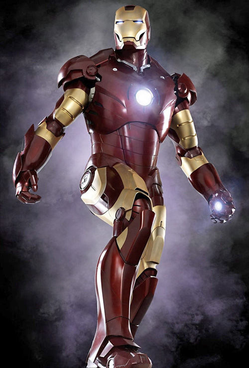
Live Action Iron Man Armour…Suuuweeeet!

This news got me smiling today! I was heavy into comic book collection from age 11 until I was around 18, but even when I stopped actively collecting I’ve remained a big fan of comics and still buy a few graphic novels or compilations every year. Comic book movies are more accessible to me than comic books are (it’s such a pain to track down every issue of a series unless you’re buying them from the start), and Iron Man is one movie I’ve been looking forward to seeing come to the screen for a long time. I’m hoping it will be the calibre of Spider-man and X-Men, and not the calibre of Electra or Ghost Rider (hey, I still own all of them). Of course, if I was really geeky, I’d buy one of these as well.

iron-man-mark-iii-armor.jpg

When Digital Re-Touching Goes Too Far

It’s not often that I see true abuse of a digital technology – technology is amoral; the people who use it are the ones who decide to use it for good or bad. This site that my brother sent to me is probably the worst thing of it’s type I’ve seen, and I think it falls into the realm of technology abuse: it’s one thing to retouch an adult model (we live in an ugly, shallow world), but to do that to a child goes too far in my opinion. Most adults have self-esteem problems about how they look, but your average child under the age of ten is likely blissfully unaware of how the world works when it comes to physical beauty, and that’s a good thing. I know very little about the world of beauty pageants, although if I combine what I saw in Little Miss Sunshine with what I intuit from this Web site, I’d say that parents putting their children through beauty pageants probably don’t realize the damage they’re doing to their children. I suspect they’ll be paying for it later with therapy bills or bail money.

Back to the digital retouching: look at the image below. The “child” on the right doesn’t even look human any more. This isn’t digital re-touching, this is digital re-construction. Everything that makes the child cute has been ripped away and replaced by a horrible digital mockery of beauty. Click through the samples to see more (this one is particularly awful).

freaky-child-distortion.jpg

Ultimately the “artist” doing this re-touching work is providing a service (and some of the work is perfectly reasonable), though I openly question her/his morals for offering to do this in the first place. The real blame here lies with the parents of the children for thinking that anything could explain why they’d take a picture of their child and let some digital hack take the natural beauty away and replace it with a synthetic, digital façade that looks like something out of a sci-fi movie than real life. This is just sad.

Nickelback and Daughty in Concert

On Thursday night I went and saw Nickelback play live (thanks for bringing me along Nate!), with Daughtry as the opening band (along with Puddle of Mud and a band from southern Alberta called State of Shock). We missed the first band (State of Shock), and caught the last few Puddle of Mud songs – they were ok, but nothing special. I was really excited about seeing Daughtry live, because I’m a big fan of his debut CD. I never watched him on American Idol, I just heard the first single and thought it was great. He didn’t disappoint – his band played for about 45 minutes or so, and put on a great show. Chris’ voice was superb, and the band was insanely tight – it was like listening to the CD, only better. About the only complaint I had was that it was so incredibly loud it was hard to appreciate the nuances they were tossing into the songs. I’d definitely see Daughtry again if they came back on their own tour. Nickelback was excellent as well – I caught them last year, and they always put on a good show. It does get very tiresome though to hear them talk non-stop about smoking pot and drinking beer though – nothing changed from their last concert. Musically they were great, and I was especially impressed with Ryan Peake, the guitarist in the band. His vocals were super tight – I never quite realized how often I was hearing him sing on the CD until watching him live and seeing him back Chad Kroeger’s vocals. He also sang lead on the song “Saturday Night” and rocked it out good.

I gambled and took along my small camera (Canon SD800) because the past couple of concerts I’ve been to I’ve seen countless people taking photos and videos, so the old “no cameras” rule doesn’t seem to apply any more. The tickets said “No Cameras” but after watching people around me at the show take picture after picture, with flash, I figured I’d give it a try myself. Not surprisingly, shooting a stage that varies between dimly lit and freakishly bright with a point and shoot 3x optical zoom camera is somewhat of a challenge. Here’s the best photo I could manage:

nickelback-daughtry-006.JPG

Yeah, exactly. I thought I’d have better luck with videos, so I ended up taking quite a few – but it was mostly in vain, because the microphone on the Canon SD800 can’t cope with extremely loud noises and most of what I recorded ended up being distorted audio mixed with vaguely musical sounds. Here are three clips that turned out somewhat decently: 50 seconds of a drum solo, a clip of the crowd really getting into the song “Too Bad”, and the big-pyro-explosion ending of the concert.

EDIT: It’s really pathetic that the latest version of WordPress still maims embedded video code. Don’t the developers USE their own product?  I added links above since embedded the videos broke the template.

High Resolution Album Art Page Updated

I’ve had this page linked on up my blog for quite a while, but I’ve never actually posted about it. After updating it with 50+ new album covers that I scanned (there are now over 800 album covers), I figured it was time to give it some publicity. Here’s the write-up about it for those that haven’t visited the page before, and a warning: only do so if you have a fast Internet connection, the page is NOT bandwidth friendly at all (it’s 13 MB in size with all the thumbnails):

“Below you’ll find all of of CD covers from our music collection, including a few generic photos used for singles or indy artists that have no CDs for sale. Why did I want to do this? I really enjoy seeing the album art for my CDs, but I found the 200 x 200 pixel low-resolution, overly compressed junk that Windows Media Player included by default to be completely inadequate (ditto for the equally lame Zune software). I also found the Microsoft method of placing the album art in the music folder to be very short-sighted. When I moved songs to another computer, the songs themselves had no album art. And because FolderShare (a Windows Live service) makes all hidden files un-hidden when it syncs folders, I ended up with thousands of JPEG images scattered through my music folders. Since I often access my music via Windows Explorer rather than the ultra-slow library of Windows Media Player 10 (11 is much better at this), when I’d drag and drop the folder of music the now un-hidden JPEGs would come along for the ride and show up in my playlist and stop the music as they’d display. It was a complete mess. Embedding the JPG album art inside the audio file itself is a much more elegant solution, and it’s one that Microsoft should have implemented by now.

This time consuming project took nearly four months of work, and I couldn’t have completed it without the help of my wonderful wife Ashley (who did the bulk of the scanning). After scanning them at 300 dpi, we cropped and adjusted each of the album covers one by one. This process helped re-introduce me to my CD collection, reminding me of albums so bad I wonder why I purchased them, to albums that are so good I wonder why I stopped listening to them. This project was like looking at my own personal history with music (though I’d have to go back to the remnants of my cassette collection to get true scope).

Because neither Windows Media Player 10 nor 11 will shrink album art to fit the preview window, using the 1500 x 1500 (or thereabouts) pixel original file is impractical. It also causes some media players problems because the header of the file (where the JPEG is stored) becomes too large to process, and the audio file will not play. Thus, these 640 x 640 (or so) versions were exported using Picasa. These covers are the copyright of the respective artists and should only be used in conjunction with music that you legally own. The easiest way to embed the art inside the song itself is to use a tool such as MediaMonkey. I hope you enjoy using these album covers.

I’ll probably update the page a couple times a year when I’ve bought at least 20 new CDs, so feel free to check back now and then.
I Survived Being a Wedding Photographer

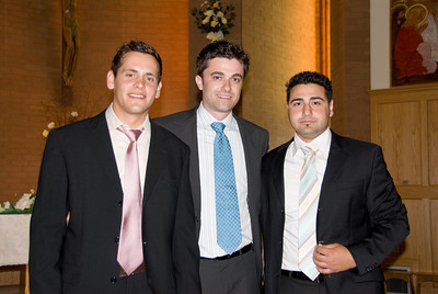
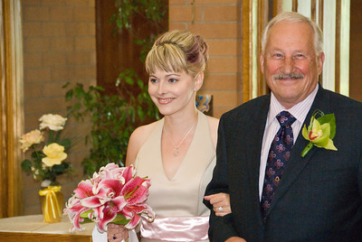
Despite the fact that I was nervous as all hell the day of the wedding, I managed to pull off some decent wedding photos. I say “decent” because everyone else seems to think they’re great, but this is the benchmark I’m comparing myself to (they go to my church), so they’re just “decent” to me. But hey, it’s good to have a goal to shoot for, right? Someday I’ll be as good as Dave and Quin. 🙂 I had a hard time with the lighting, trying to control my flash + LightSphere combination, and the fact that the Catholic priest told me I could only take photos at four opportunities during the service, and I couldn’t move anywhere other than a 180 degree arc behind the bride and groom. Here are a few random photos from the wedding ceremony (and just before it).

176908614-s.jpg
(this photo was taken by Ashley – mad photo skillz are inherent to the Dunn household!)

176908891-s.jpg

176910175-s.jpg

176913991-s.jpg

Funny thing is, the outdoor wedding I turned down shooting (I was recording the video, those pictures were taken mostly by Ashley) would have probably been  a cakewalk compared to shooting inside the church. My confidence as a wedding photographer was boosted by this whole experience, that’s for sure.

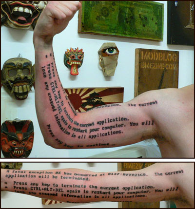
Blue Screen of Death Tattoo

I just had to post this because it’s so crazy…check this guy out!

bsodtattoo.jpg

Twenty years from now when we’re all using Macs (well, hopefully not) no one will know what this even means.

Loving Fast Lenses

Last weekend I took my Nikon D200 and my 50mm prime lens, the cheap F1.8 one, out for a spin. I’ve had poor (blurry) results from this lens in the past because I think I had adapted my shooting style leaning on the image stabilization in the 18-200mm lens as a crutch. The 50mm prime lens has no image stabilization, so if I’m not steady, the photos are blurry. I focused more on stability, and the photos came out fantastic – the early evening summer lighting was soft and glorious, making every shot look superb. Here are a few of my favourite shots from the shoot.

173411121-s.jpg

173411525-s.jpg

173410326-s.jpg

173410807-s.jpg

Turning on BCC (Blind Carbon Copy) in Windows Mail

I’ve been using Vista’s Windows Mail (the re-born Outlook Express) on the computers where I don’t want to have Outlook 2007 installed, and in generally it’s a pretty decent mail solution. I’m using IMAP so my email is the same on all the computers. One important solution I had to configure was using FolderShare to synchronize the /contacts folder between all my PCs so each PC had the same contacts. I wish Microsoft acknowledged and provided solutions for multi-PC households – they seem to have their head stuck in the sand when it comes to that.

At any rate, I wanted to email a bunch of people today and like any good, rational person using email I wanted to use the Blind Caron Copy (BCC) field to protect the privacy of the people I was emailing, and to lessen the chance of it being blocked by spam filters. So I start clicking through the menus, and nowhere do I find a simple “View BCC”. What the hell? I looked through the options, and even tried the help file. There isn’t a single result for the terms “BCC” or “blind carbon copy” (in quotes). Who writes these help files?

I finally turned to an online search and discovered that in order to view the BCC field I had to click on “All Headers” under the View menu. That’s absolutely inane – why could you have a UI element that doesn’t include the keyword that the user is looking for? To quote Monty Python, someone should be sacked.

12 x 12″ Paper and FotoFusion: A Great Combination

Since installing and reviewing v4 of FotoFusion, I’ve been really enjoying using it to create photo layouts – it’s amazing how quickly I can whip one up, and it’s equally amazing how quickly I can remove frames, resize them, and keep them locked into the grid so everything is clean looking. I ordered some 12″ by 12″ matte paper from an eBay seller a few weeks ago, and I decided to combine the two: creating a photo layout with FotoFusion and printing it out on the 12″ x 12″ paper. Here was the result:

This is such a fantastic way to create a unique, great way of remembering an event: I’m hooked and I suspect I’ll be printing many more 12 x 12″ prints in the future. I printed up several of these and gave them to a few of the people involved, and they all loved them. Scenarios such as this are when I feel I’m most successful with technology: when I can take useful software, a bit of photographic skill, a nice printer, and create something that people can cherish for years to come. That’s when technology works as it should.

Dell Kicked Out a Cool Commercial

We’ve all seen a lot of Dell commercials over the years, and let’s face, they’ve been as exciting as watching paint dry. The “Dell Dude” commercials were funny in the short term, but irritating in the long term. Dell has never tried to be hip or cool, and that’s for good reason: their products haven’t ever really been hip or cool. People have tended to buy Dell products because they provide good value for the money, not for how they look. Over the past couple of years they’ve started to change that with their XPS line of gaming and performance machines, and recently they’ve really kicked it up a notch with their launch of new Inspiron laptops and desktops. The laptops in particular have a nice “wow” factor with a choice of eight different colours, three different screen sizes, and all of the customizations Dell offers (CPU, RAM, etc.). But here’s what really caught my attention: I was watching a show on the SPIKE TV network and check out the commercial I saw:

Dell Inspiron Commercial
Uploaded by jasondunn

That’s completely unlike anything Dell has ever done in terms of marketing, and I think it works really well. Finally, a Windows PC maker trying something different! Catchy song, memorable video, and it shows just enough about the product to entice you to visit the site and check it out. The only thing I didn’t like about it was the Intel blurb at the end – it takes some of the shine off the commercial with that old and tired four-tone Intel branding. Dell mentioned Intel in the commercial, I don’t see why Intel had to also have their lame plug in there. Still, I think it works – what do you think?